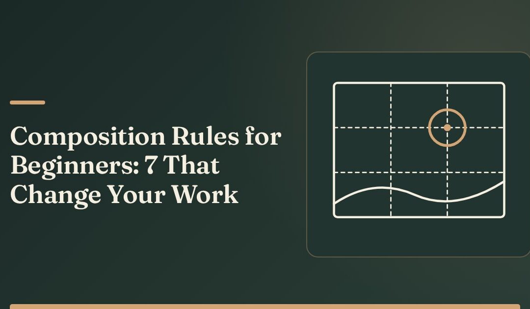
Composition is where you put things in the frame and what that arrangement makes the viewer look at first. The composition rules for beginners that matter most are not aesthetic preferences — each one is a tool for controlling attention. Learn seven of them and you will be able to diagnose why an image feels flat instead of guessing.
This applies across photography, illustration, graphic design, and video framing. The frame does not care what made the marks.
Below is each rule, what it actually does, and how to test it in your own work today.
Start With the Real Question: Where Does the Eye Go First?
Before any rule, train one habit. Look at your piece, then look away, then look back and notice where your eye lands first.
If it lands on your subject, the composition is working. If it lands on a bright corner, a tangent edge, or an accidental shape, you have found your problem. Every rule below is a way of steering that first landing.
The eye is pulled by contrast, by sharpness, by faces, by convergence, and by anything that interrupts a pattern. Those are your levers.
1. Rule of Thirds — Break the Dead Centre
Divide your frame into nine equal rectangles with two horizontal and two vertical lines. Place your main subject on or near one of the four intersections rather than in the middle.
What it does: dead-centre placement reads as static and leaves symmetrical dead space on both sides. Off-centre placement creates tension and gives the subject somewhere to look or move into.
How to apply it: turn on the thirds grid in your camera or canvas. Put horizons on a horizontal line, not through the middle. Put eyes on the upper horizontal line in portraits.
When to break it: deliberate symmetry — architecture, reflections, confrontational portraits — wants dead centre. Centre it fully or not at all; near-centre is the weakest position.
2. Leading Lines — Give the Eye a Path
Any strong line in the frame will be followed. Roads, fences, shadows, a row of windows, the direction of a gesture, a column of text.
What it does: lines deliver the viewer to the subject instead of leaving them to search. A diagonal does this more forcefully than a horizontal because it reads as movement.
How to apply it: find the strongest line already in your scene or layout, then move your position or your subject until that line terminates at the subject. Lines that exit the frame without arriving anywhere drain attention out of the image.
Watch for Lines Pointing Out
A fence that runs out of the bottom-left corner sends the eye off the page. Rotate, recrop, or reposition so lines travel inward.
3. Negative Space — Let the Subject Breathe
Negative space is the empty area around your subject. It is not wasted; it is what makes the subject legible.
What it does: emptiness increases perceived importance. A small subject in a large quiet field reads as significant and often as calm or isolated. A subject crowded to the edges reads as busy or tense.
How to apply it: when a piece feels cluttered, remove elements instead of rearranging them. Try one version with 60 percent of the frame empty. Beginners almost always fill too much.
4. Visual Balance — Weigh the Frame, Do Not Centre It
Every element has visual weight. Big, dark, high-contrast, sharp, and human things are heavy. Small, pale, soft, and abstract things are light.
What it does: an unbalanced frame feels like it is tipping, and the viewer feels it before they can explain it.
How to apply it: imagine the frame balanced on a point at the centre. A heavy subject on the right wants something light on the left — a small bright shape, a bit of texture, a secondary figure — not a mirror image. Matching weights exactly produces symmetry; offsetting them produces interest.
5. Framing — Use Foreground to Enclose the Subject
Shoot or draw through something: a doorway, branches, a gap between two figures, a window, an arch.
What it does: a frame inside the frame adds depth by establishing a near plane and a far plane, and it blocks the edges so the eye cannot escape.
How to apply it: look for something close to you to include at the edges, even slightly out of focus. In design, a border, a container, or a band of colour does the same job.
6. Contrast and Value Structure — Build in Three Tones
Squint at your work until detail disappears. You should see a clear arrangement of light, mid, and dark shapes.
What it does: value structure is what reads from across a room. Colour and detail matter far less. Most weak images are weak because everything sits in the same mid-tone range.
How to apply it: assign roles. Make the subject the lightest thing against darker surroundings, or the darkest against lighter. Convert to greyscale to check — if the subject disappears in greyscale, no amount of colour will save it.
The Squint Test Is Faster Than Any Rule
Squint at your piece for two seconds. If you cannot tell what it is about, the composition fails regardless of thirds, lines, or balance.
7. Simplify Until One Idea Remains
Decide what the piece is about in one short sentence. Then remove or subdue everything that does not serve that sentence.
What it does: images with two competing subjects read as having none. The viewer bounces between them and leaves.
How to apply it: list every element in the frame. Mark each as subject, support, or noise. Cut the noise, soften the support — blur it, darken it, desaturate it, crop it out — and leave the subject sharpest and highest in contrast.
A Quick Diagnostic Checklist
Run this on any piece before you call it finished.
- Does my eye land on the subject first, within one second?
- Is the subject off-centre, or fully centred on purpose?
- Does the strongest line in the frame arrive at the subject?
- Can I remove 20 percent of the elements without losing the idea?
- In greyscale, is the subject the lightest or darkest shape?
- Are there bright or busy areas near the edges pulling attention outward?
- Does anything important touch or nearly touch an edge in a distracting way?
- Can I say what this piece is about in one sentence?
Two failed answers usually explain a piece that “feels off.”
How These Rules Interact
| Rule | Primary job | Most common beginner error |
|---|---|---|
| Rule of thirds | Placement and tension | Subject dead centre by default |
| Leading lines | Directing the eye | Lines pointing out of the frame |
| Negative space | Emphasis and clarity | Filling every area |
| Visual balance | Stability | Mirroring instead of offsetting |
| Framing | Depth and containment | Nothing in the foreground |
| Value structure | Readability at a glance | Everything in the mid-tones |
| Simplification | Single clear idea | Two competing subjects |
Notice the overlap. Strong value structure does half the work of simplification. Good negative space often creates balance for free. You are not applying seven separate checklists; you are using several views of the same question about attention.
When to Break Composition Rules
Break a rule when you know what it was holding together and you want the opposite effect.
Centre a subject to make it confrontational. Crowd the frame to make it claustrophobic. Flatten the value range to make it quiet and hazy. Point lines outward to create unease. These are all legitimate choices — but they only read as choices when the rest of the piece is controlled.
The test is simple: can you say out loud what effect you are buying and what you are paying for it? If yes, break the rule. If the answer is “it just looked right,” check the diagnostic list first — about half the time the instinct is correct and the other half it is a habit.
Practise One Rule at a Time
Pick one rule from this list and apply it to ten pieces this week, ignoring the other six. Isolation is what builds judgment; trying to satisfy all seven at once produces careful, lifeless work.
When you want a structured sequence of composition exercises with critique prompts built in, start with the foundations track in the Creative courses section and work it in order.